About OrthoGraph, the company
“OrthoGraph Ltd. was established in Hungary, 2004 by private investors. Its main activity is the development of mobile based data acquisition software with focus on graphical real-estate measurement. Our goal is to create products by which we can provide wide range support for graphical real-estate measurement. This does not mean only the flow control of survey processes during on-site measurements, and increasing the productivity of our users, but includes also the high level support of e.g. facility management and inventory creation activities what makes possible the usage of measured electronic data in these areas.
We base our activities on those professional specialists, who are responsible for the effective usability and quality of our portfolio, and their experience is won from their everyday professional work. These criteria are defined by the continuous cooperation with our customers and partners, who use our products in their everyday activities. This makes us possible to become the market leader and keep this position by us for the future too. As far as our products are giving a solution for the needs coming from our customers’ everyday experiences, we can provide numerous unique solutions, that are unique worldwide too.”

OrthoGraph’s visual identity
“We use simple and modern visual elements that places the content above all. The vibrant, but harmonizing colors and the minimalist interfaces and illustrations help our users to quickly understand our products and achieve their goals withouth distracting them from their work.
We create user interfaces with a coherent style and symbol system that can be broken down to the very basic symbols that our wide range of users are already familiar with and a color scheme that has an easy-to-follow internal logic, which seamlessly helps anyone working with OrthoGraph products trough the optimal workflow.
In case of illustrations – both drawn and photographed – we create our own, since we believe that custom visual ques are the most effective in communicating the right message without any distracting details.”
The quotes were taken from the “OrthoGraph Orange – Visual identity guidelines” brand identity guide.

The logo
OrthoGraph’s logo was refreshed by me in 2015, when I started working with the company. The symbol was flattened and simplified and the typeface was replaced so it better suits modern standards. Also different variations were created, like the monochrome version that can be used on coloured background, or the quadrangular version.
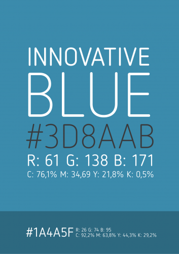
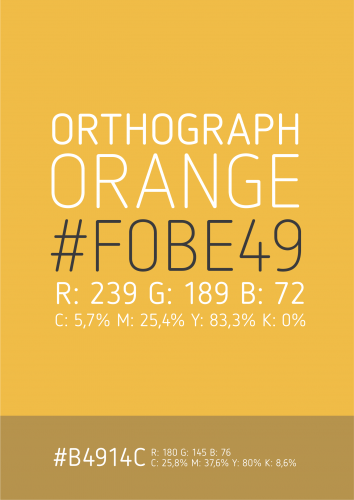
The colors
The original colour of the company was tweaked and registered as “OrthoGraph Orange” in the brand identity guide, and a new colour, “Innovative Blue” was introduced. The company is mostly presented with OrthoGraph Orange, but the applications and services use the Innovative Blue as an indicator for interactive elements and this colour is also present in the marketing materials when showcasing the products.


Icons and illustrations
All the icons and illustrations were custom created for OrthoGraph both for the applications and the websites, or printed materials.
Websites
OrthoGraph has several websites, but orthograph.net is the main one. It is a huge website running on a custom wordpress theme that showcases the products, offers downloads and information about the services and provides contact with our partners and users.
OrthoGraph Cloud Services has a separate website, where the cloud services can be accessed and registration for the applications can be done. You can learn more about the cloud.orthograph.net website here.
The company also have several microsites that were created to reach different audiences. These are mostly pure html/css websites, since the goal was to create simple, fast and SEO-friendly websites.
OrthoGraph Survey System applications
Now OrthoGraph I is the main product of the company – and is the solution for all our customers. This is the second generation of the app family that is redesigned by me, the first generation (where the new style was introduced) is OrthoGraph for tablets.
Printed marketing materials
Flyers, roll-ups, stand designs, posters and business cards are all covered in the “OrthoGraph Orange” brand identity guide. The company has multiple styles for its different products and audiences, but the basics, such as colors or fonts remain consistent. The flyers are frequently redesigned and refined, they change and evolve with the company and its products.